The Home dashboard is the first thing you see when you enter a workspace. It answers four questions in order: what is our footprint, what needs attention, how much should we trust the number, and where do we reduce it.
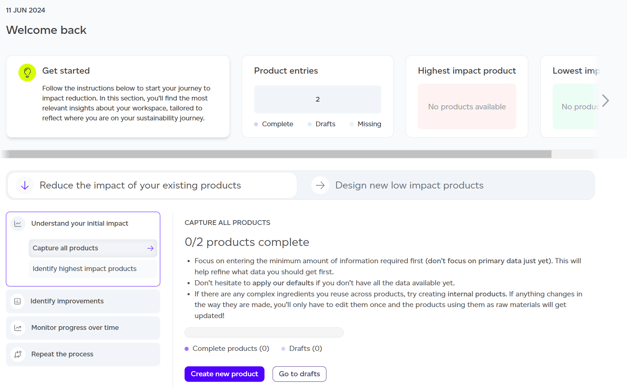
You can reorder or hide the sections with 'Customise' in the top right, and the reporting period selector at the top decides which report every figure below is drawn from.
Portfolio footprint and trajectory
The headline is your total impact for the selected period, with the number of products and units behind it, so you can see at once whether it covers what you think it does.
Beside it, the trajectory plots reported impact against the path to your target. The chart shows where you were at baseline, where you are now, and the straight line to your commitment, which is what makes "on track" a statement rather than a hope.
Needs attention
A short list of things waiting on you: products flagged for data quality, a reporting period about to close. Each is actionable, and the panel is empty when nothing needs doing rather than showing reassurance.
Data confidence
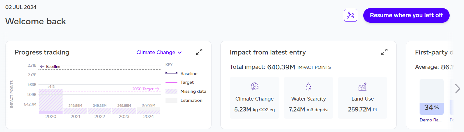
Four cards answering how much of the number is yours and how well it represents your products:
- Product entries: how many products are modelled against your target, and how many are still missing.
- Data quality: the portfolio DQR average, where 1 is best and 5 is worst, with the worst-scoring product called out. See Understanding your data quality score.
- Primary data share: what proportion of the footprint rests on your own data rather than database defaults, and which product is least covered.
- Raw material origin: how many of your sources are yours, split between Registry, override and secondary data. Each source counts once, so a trace ingredient counts the same as a major one.
Where to reduce
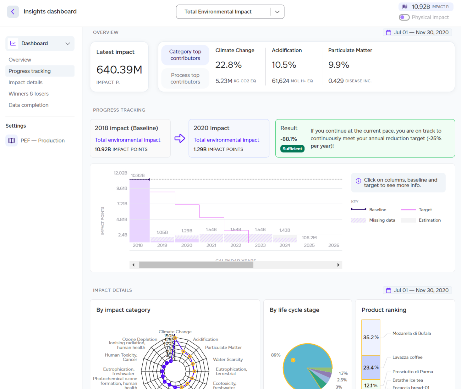
Largest contributors ranks products by share of the footprint, with the life cycle stage carrying each one, its data quality, and how it has moved. It is a shortlist for reduction work: the top rows are usually most of the footprint.
Impact profile shows all 16 PEF categories normalised and weighted, marking the largest few. It is how you tell a climate story from a water story, which changes what a sensible reduction looks like.
Reduction targets and picking up
Reduction targets shows progress against each commitment. Pick up where you left off lists what you and your colleagues were last working on, with shortcuts to add a product, upload volumes or start a report.
If the dashboard looks empty
Every figure is drawn from calculated products in the selected period. A new workspace with no products, or a period with no report, will show empty sections rather than zeros, because zero would be a claim.