A footprint is only as good as the data behind it. The Data Quality Rating (DQR) scores that data using the PEF method's own criteria, so a number you publish comes with a defensible statement about how well founded it is.
Lower is better. 1 is the best score and 5 the worst.
The four criteria
The overall rating is the average of four, each scored 1 to 5:
- P, representativeness of the process: how closely the dataset used matches the process it stands in for.
- Te, technological representativeness: whether the dataset describes the same technology you actually use, or a proxy for it.
- Ti, time representativeness: how current the data is. Confirming that a figure is still accurate improves this, which is why the platform asks you to.
- Ge, geographical representativeness: whether the data describes the place your process happens.
Where you see it
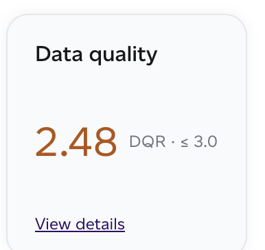
- On a product report, as a Data quality card showing the score against the threshold, with 'View details' for the criteria behind it.
- In the products list, as a DQR column, so you can sort a portfolio by how well evidenced it is.
- On the Home dashboard, as the Data quality card, with the portfolio average and the worst-scoring product.
- On a volume report, under the Data Quality tab, aggregated across everything the report covers.

The report view answers three things at portfolio level:
- Study score: the volume-weighted average across scored products, with the four criteria behind it. Volume-weighted, so a product you ship in quantity counts for more than one you barely sell.
- Company datasets: the worst company-specific dataset in the portfolio, against the level the method requires. This is a floor, not an average: one bad dataset is a finding whatever the mean says.
- Flagged products: how many carry any unit over its Data Needs Matrix threshold.
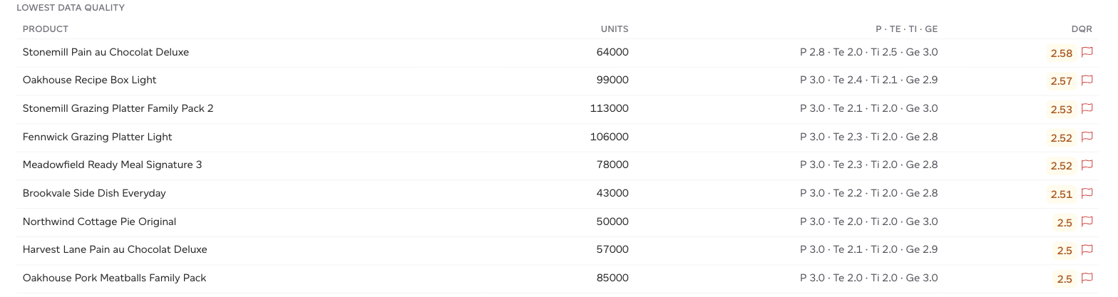
The score distribution shows how the portfolio spreads across the bands, and Lowest data quality lists the worst-scoring products with their four criteria and a flag where one applies. That list is the work queue.
Your own products used as ingredients
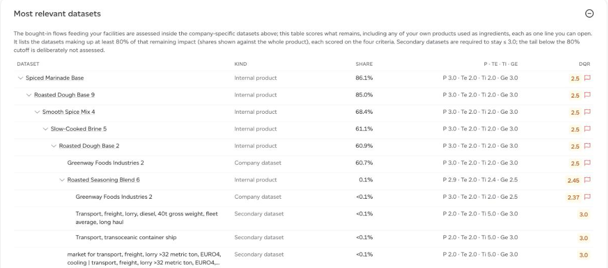
On a product report's Data Quality tab, a sub-recipe or internal product you use as an ingredient is scored as one line, with the kind Internal product. Click the arrow beside it to open what it is made of, down through its own sub-recipes, each with its share of the parent; click its name to go to that product's own Data Quality tab.
A line flagged from inside ("Something inside this internal product is over its requirement") starts open, so the dataset causing it is in view rather than hidden in an average.
Most relevant units, and flagging
Not every input matters equally. The score concentrates on the most relevant units, the parts of the model carrying the bulk of the impact, because improving a dataset that contributes a fraction of a percent does not change how much you should trust the answer.
A product is flagged when a dataset it depends on exceeds the threshold set by the Data Needs Matrix. The Home dashboard's Needs attention panel counts flagged products, and fixing those is what lifts the portfolio score.
Improving it
In order of effect:
- Replace secondary data with your own. A supplier figure or a measured value beats a database average on every one of the four criteria at once.
- Confirm what is still current. Time representativeness improves as soon as data is confirmed as accurate, with no remodelling.
- Match geography and technology. Where a closer dataset exists for your region or process, selecting it improves two criteria directly.
- Start with the flagged products, and within them the most relevant units. Everything else moves the number very little.